

About Chime
Chime is on a mission to help millennials lead healthier financial lives. They plan to achieve this by eliminating unnecessary fees and using technology to help members form healthy financial habits. Members get a Chime Visa Debit Card and an FDIC bank account that can be managed entirely from their smartphone.
My Role
Design Research, Usability Testing, Wireframes, UX + UI, Concept Development, Prototyping. I also took the lead in creating the usability testing guides for the team.
The Challenge
Design an optimal home screen for their Android app based on millennial banking research and validation of the existing iOS beta design.
TL;DR
Chime challenged us to create a more positive and trustworthy banking experience by redesigning their Android beta home screen. Over the course of 4 weeks, we delivered:
- Research on millennial's motivations and behaviors towards personal finance
- Insights from usability testing their iOS beta home screen design
- An optimal Android home screen design based on our findings
Check out our Android prototype here. Or take a look at a sample of the work below:
The Process
Research
Learning about the different mental models of millennials towards personal finance was a unique aspect to this project especially as a millennial myself. To inform our design strategy, we used a variety of research methods to uncover important insights. Based on Chime's needs, we split our initial research phase into two parts.
- Problem Space Exploration
- Usability Testing of their iOS beta design
Problem Space Exploration
To get a lay of the land, we first took a look at Chime's existing market research and ran a competitive analysis. We looked at other models that shared Chimes's values in using technology and removing fees.
Next, we conducted interviews with millennials to understand their needs and behaviors towards personal finance. For a more holistic view of the market, we created provisional personas of Chime's current and target users to guide our interviewing process.
With Chime's target users in mind, we conducted five interviews with techie millennials who recently graduated from college. Our objective was to:
- Validate that Chime's direction towards a banking + personal finance product is something people want and value
- Understand the values and aspirations of millennials in managing their finances


After our interviews, we synthesized our learnings and found some clarity in the problem space:
- Users wanted rewards programs and information on how to build their credit scores
- 'Round ups' or 'Keep the Change' features didn't have mass appeal
- Switching banks is a big endeavor that would require strong incentives
- Users expected expertise & trust in their bank
- Security is top of mind when considering a mobile-first bank
Predictive Personas
Based on our user insights, we iterated on our personas to guide us in designing for Chime's future users.
Usability Testing
Chime wanted us to conduct usability and comprehension tests for their iOS beta design. Aside from discovering what users liked/disliked, we learned about what aspects to integrate into the new Android home screen design.
I took the lead in creating the usability testing guide by mapping out key tasks and structuring scenarios for each of them. I also created some comprehension questions on any icons or language that seemed confusing for first-time users.
After conducting five tests on techie millennials ages 22-30, we grouped the pain points into themes and used a 2x2 matrix to visualize patterns.
Lo-Fi Design
To kick off our ideation phase, we framed our challenges as opportunities for design:
- How might we show Georgia where she stands on spending/saving so she can have control over her financial life and develop healthy financial habits?
- How might we provide Georgia with a positive banking experience while alleviating negative emotions around personal finance?
Before going into design sprint mode, we explored different ways we could reorder the elements from the iOS beta design to provide a cozier user experience. As a team, we ranked each element based on what we believed as most important to the user and restructured the home screen accordingly.

Now that we had a sense of order, we sketched out some ideas with our research insights in mind.


Our brainstorm session resulted in the idea that more financial data visualizations and graphics would remove cognitive load for our users. We diverged and moved into Sketch to design some ideas for the top 3 elements: Accounts Summary, Recent Chime Transactions, and Savings Outlook.


After a few more rounds of ideation, we ended up with two lo-fi versions we wanted to test out. The two home screen elements we largely redesigned were the Account Summary and Savings Outlook.
Version A (left) and Version B (right)
Lo-Fi Validation
To validate our changes, we conducted five usability tests on techie millennials ages 23-30 for both versions. 2/5 users we tested were existing Chime users.
Aside from these two sections, we collected plenty of good insights on the other home screen elements:
- Account Summary: version A was more informative, but version B was more visually appealing
- Savings Outlook: If users can clearly see the value provided (increase in savings) by using their Chime card (vs. credit card), it would incentivize them to use it more frequently.
- Recent Transactions: liked the icons and self explanatory, but one user was confused if this was for all accounts or only Chime checking
- Refer a Friend: not motivated to use this and unsure of what the incentive was
- Additional comment: one user wanted quick advice on spending
After presenting our insights and collecting feedback from Chime, we moved on to hi-fi prototyping.
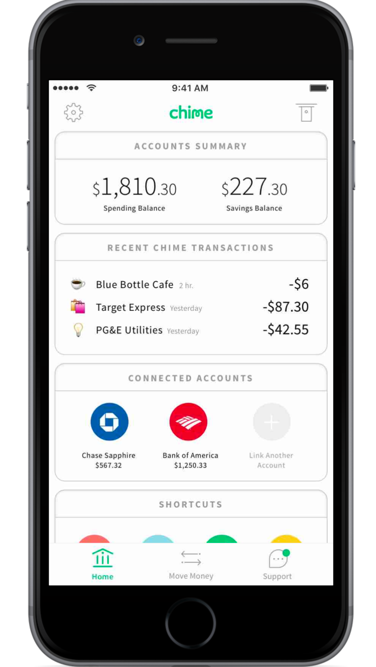
Hi-Fi Design
Some feedback we collected from Chime to inform our next design phase were:
- First thing members should see is their checking balance
- Savings Outlook graph needs to be simpler
- Connected Accounts update can take up to 8 hours
- Try to design for your drunk friend
With these tips in mind we jumped straight into design sprint mode.


For this design sprint we used more elements of modern card design.
Examples of a card collection
We also focused in on breaking down information from the checking and savings accounts even more. And to remove cognitive load from the Accounts Summary section, we removed the Connected Accounts information and made it its own element again.


Hi-Fi Validation
With our latest changes, we conducted 5 usability tests on techie millennials ages 23-33.
Pop-up Modal Feedback
Positives:
- 2/5 users found this habit-forming and positive
Pain points:
- 1 user found it distracting
Account Summary
Positives:
- Comprehension was not only clear, but quick. Users understood what they currently had and what they’ve been spending
“I like [that] the available balance number is strong visually.”
Pain Points:
- 1 user wanted to see how round ups affected the total available balance

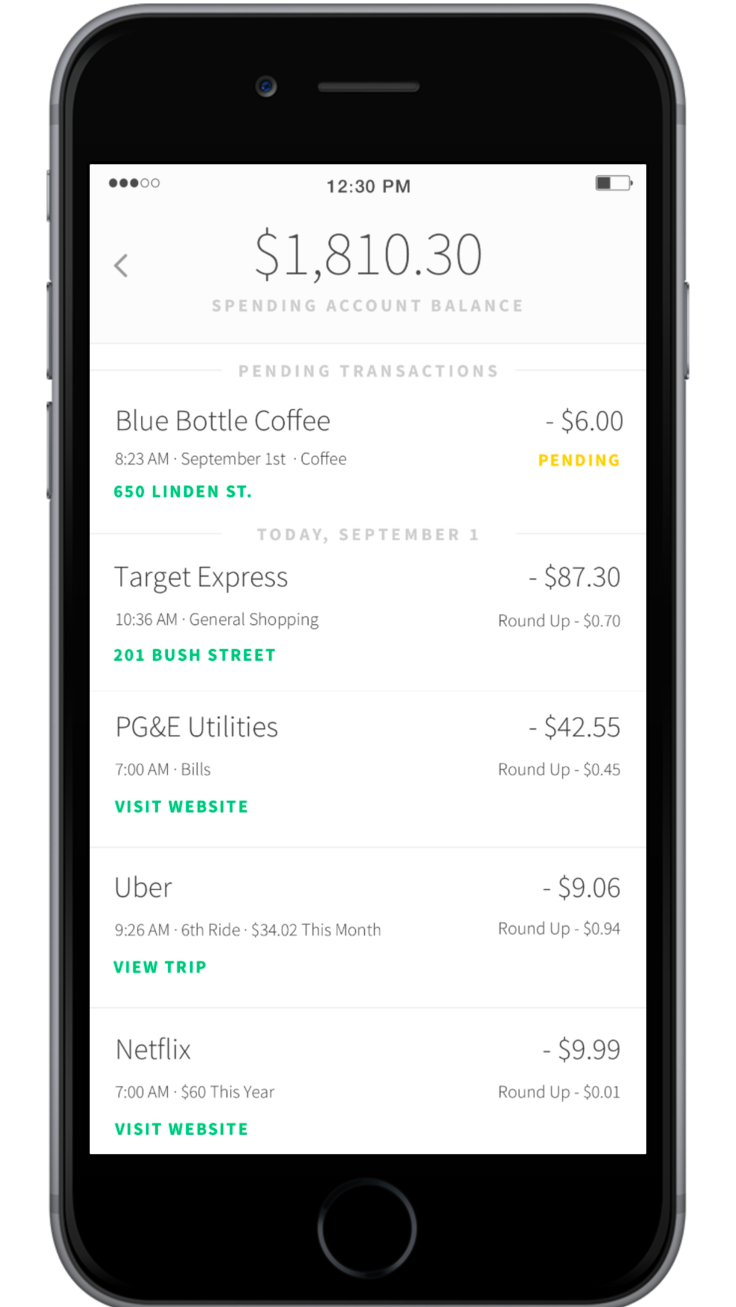
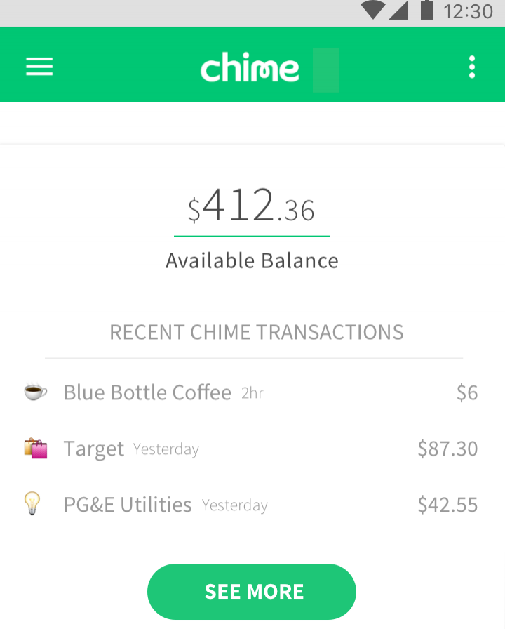
Recent Transactions
Positives:
- Made sense, “I like the emojis”
Pain Points:
- Pending vs. no pending?
- People went to hamburger menu first
Savings Outlook
Positives:
- Users found this positive and liked seeing the percent increase
“It’s a helpful big picture -- nice feature for a comparison between now and last month.”
Pain Points:
- Did not understand what bonuses meant
- Unclear source of savings and projections
- Text in info button didn’t tell me if balance was my total from last month or since I joined Chime
- X value on the graph not clear at first glance
Refer a Friend
Positives:
- Button is clear, subtle, and provides a good incentive to share
Pain Points:
- Some confusion around what the bonus actually is, and discomfort around a sharing functionality in a banking app
Connected Accounts
Positives:
- 2/5 understood how to add accounts immediately
Pain Points:
- 4/5 thought maybe transfer money icon could be used to add an account (placement issue)
- 1 wasn’t clear on debit and credit distinctions per accounts
Delivery
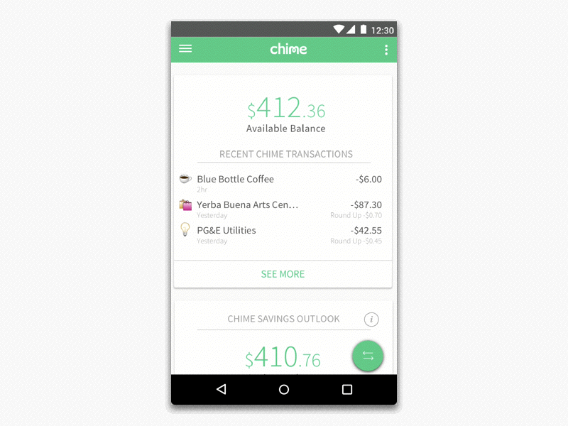
With our last round of user insights and client feedback, here was our final prototype:
Conclusion
Chime challenged us to create a more positive and trustworthy banking experience by redesigning their Android beta home screen. Over the course of 4 weeks, we delivered:
- Research on millennial's motivations and behaviors towards personal finance
- Insights from usability testing their iOS beta home screen design
- An optimal Android home screen design based on our findings
Users responded well to the interface, and the client loved it! The Chime team is building elements we created into their product now.